Introduction:
The Tower and the Plant
(original pages indicated in grey)
9
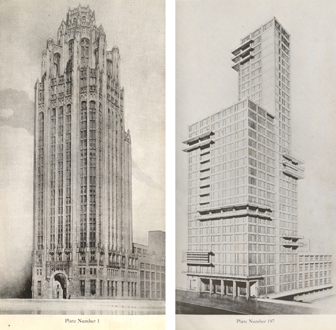
In 1922, the Chicago Tribune invited architects from around the world to submit designs for a new office building. The competition, in which 260 entrants competed for $100,000 in awards, remains a centerpiece of design history, in large part because it produced a portfolio that captures a wide variety of new directions in architecture.1 Among them, a proposal by Adolf Meyer and Bauhaus founder Walter Gropius exemplifies an emphatically modern approach that would not gain significant footholds in the Chicago skyline until mid-century. Meyer and Gropius’s minimally-embellished, asymmetrical bundle of rectilinear forms was modeled to extend and echo the utilitarian lines of the newspaper’s existing printing plant. This proposal, however, was pushed aside in favor of one submitted by the American architects John Mead Howells and Raymond Hood, which fused the modern skyscraper to the Gothic cathedral, complete with structurally-redundant flying buttresses. [Figure 1] This decision was emblematic of the initial resistance to aesthetic modernism in the United States, despite the country’s status as a harbinger of the experience of modernity for many European artists and intellectuals. Chicago had staged an elaborate spectacle of this resistance 30 years earlier when it staged the World’s Columbian Exposition in an idealized (and almost entirely temporary) neoclassical city — built on the periphery of a metropolis deemed too smoky and sludge-choked for international dignitaries.2 Taken together, the eclectic visions for the Tribune tower capture a pivotal moment of negotiation between the traditional imagery of power, beauty, or order and new questions posed → 10 by “the machine”: that alien agglomeration of human labor and knowledge which the architect Frank Lloyd Wright had recently described as “the modern Sphinx — whose riddle the artist must solve.”3
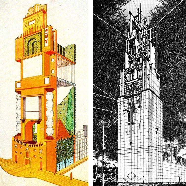
This dissertation begins by filling out the story of the “machine aesthetic” in modern design. As we will see, conflicting appeals to tradition, nature, and mechanization were central to debates not just in design, but also in established national economies and revolutionary political movements. The existing Tribune tower and the many sketches of what it may have become are canonical objects in this story, representing a relatively small group of “great men” who trafficked in the big, influential ideas of their day. In its second half, this dissertation pivots to a linked but largely unacknowledged cast of working people. This will set us on a trajectory that leads directly through the unassuming structure behind the tower. The squat Tribune printing plant is the one constant of the divergent proposals, and even of many of the postmodern “Late Entries” commissioned by the architects Stanley Tigerman and Stuart Cohen in 1980. [Figure 2] In the late 1940s, the plant was the site of a labor conflict that would have deep ramifications for the bargaining position of American unions, the reputation of the news media, and the history of communications technology. As we will see, strike-breaking measures taken during the 1947–49 Chicago Printer’s Strike included technical innovations that would, in time, contribute to a transformation of the practice of graphic design. This study thus moves from the tower to the plant: from exalted reflections on technology and industry in the abstract to the concrete relations of power that prevail in what Marx called “the hidden abode of production.”4
11
12
Design, Printing, and the Idea of the “Type”
As recently as the last decades of the twentieth century, the circulation of written texts depended upon the labor of typesetters. Working initially with metal type blocks, then photographic negatives, and finally digital codes, typesetters rewrote everything from book manuscripts to magazine articles and advertisements. As they worked to reconstitute these texts in a printable format, they made discerning judgments on spacing and hyphenation, which depended upon strict visual and grammatical conventions. Most were also trained as proofreaders. In short, typesetters did much of the work that now occurs (however opaquely) in the background of the digital communications media that we use today; the Microsoft Word document in which I am now typing is one obvious example.
Typography is defined as the practice of printing with standardized, interchangeable characters — in contradistinction to its predecessor xylography, which uses a single uninterrupted relief surface like a plank of wood. An impressive early realization of the typographical method dates from eleventh-century China, where standardized printing blocks made of clay and glue were stored in large, rotating discs.5 Historians of printing have concluded that the sheer number of characters in the Chinese written language must have rendered the system too unwieldy; it remains unclear whether Johannes Gutenberg was aware of these experiments when, in 1439, he perfected his own system of movable type using small blocks of foundry metal.6 These blocks came to be called “sorts,” so named because they were sorted into compartmentalized cases when not in use. The “upper case” held the majuscule letters that had → 13 descended from chiseled public inscriptions; the “lower case” held the miniscules that had first taken shape in handwriting.7 The typographically-printed book, in combination with early broadsheets and newsletters, played important roles in the expansion of literacy, the Protestant Reformation, the rise of “the nationalist idea” and of the “bourgeois public sphere”; it was also one of the most complex and complete early examples of the standardized commodity.8
Given its deep imbrication in both language and capitalism in the West, the history of typography also evokes a history of fantasies and anxieties: about difference and homogeneity, the original and the copy, or traditional craftwork and “labor-saving” technology. Some of these tensions survive today in the very words with which we think inscription and communication. Anyone filling out an official document, for example, knows to verify their identity with a signature: a singular, often illegible mark of individuality. Otherwise, one is instructed to “print”: that is, to write in standardized letterforms. We thus draw each letter to approximate its “type,” unless we “type” (verb) — that is, write with types, as was first made possible for non-specialists by the typewriter. Prior to the emergence of typographical printing, it was common enough to misspell words; the advent of the phrase “typographical error,” however, implies an extra step — or a third party — inserted between writing and reading.9
Amid the industrial revolution and the rise of mass reproduction, entire pages became “types.” Arranging thousands of sorts into a single page composite was slow, tedious work → 14 compared to the increasingly automated presses of the later nineteenth century. Metal casts of typeset pages provided an expedient, allowing multiple copies of a page to be printed simultaneously. These cast copies were named “stereotypes”; “clichés” is the onomatopoetic equivalent in French, evoking the clicking and slipping of the press mechanism.10 And stereotypes could also be pictures. Cheap, sensationalist publications of the nineteenth century, for example, frequently resorted to stock portraits: not images of particular individuals, but of noble or criminal “types” that were re-used in varying contexts.11
As historian of technology David Alan Grier has documented, the present-day term “computer” is the stump of a phrase that began to fall out of use in the 1950s.12 Such machines were initially called “electronic computers” to distinguish them from the human variety — who worked out calculations with pen, paper, and slide rule, often in large groups in factory-like conditions. The word “printer” has undergone similar shifts: in contemporary usage, it more likely refers to a piece of office equipment than a type of worker. Unlike the departed human computers, however, printers still exist as living agents in the production process. Well into the twentieth century, such workers understood their profession in the unified craft terms of the pre-capitalist world. Printing was not just an “art” but “the art preservative of all arts” — and thus, at least in part, the grounds of possibility for culture as such. Continuing advances in efficiency and productivity, however, have progressively whittled away the printer’s purview, which once embraced editing, publishing, and much of what we now call graphic design. More recently, the → 15 idea of the printer seems to have undergone a further mutation. In the midst of this century’s intensification of decentralized, algorithm-driven work, the “3D printer” briefly became a central fixation for the specter of “disruptive” technology. In their actual mechanics, however, these machines bear little resemblance to printing as I have been describing it. The name “printer” seems to fit because it implies a miniaturized and self-contained manufacturing process: one not guided by the embodied knowledge and skill of a craftsperson, but instead defined by a capacity to produce without any human intervention at all. In short, because typography took shape in the mass-production mechanism of the printing press, it has always been implicated in the thorny subject of “automation” — and thereby, as we will see, in the intertwined dynamics of overwork, underemployment, and runaway production.
During the late nineteenth century — just, in fact, as the first mechanized typesetting systems were being introduced — new aesthetic movements were taking shape across industrialized Europe, where the visual style of public power and personal refinement had long been defined by the classical tradition. That hegemony had recently been challenged by the Gothic Revival and Arts and Crafts movements, which sought to recover the dignity of the handicrafts and of local structural and ornamental idioms. However, movements for a machine-like “New Sobriety” or a spiritualized purity of form quickly followed in the 1910s and 1920s. Peter Behrens, a German architect regarded as one of the first “corporate identity” designers, was a proponent of an approach referred to as Typisierung, or “type-making.”13 Limiting objects of daily use to a handful of standard forms promised a rationalization of the chaos of the market. At the same time, such efforts offered modern people a single, all-encompassing “style” — to → 16 mirror, without direct mimicry, the perceived consistency of classical architecture and art. This position was broadly influential, and it was soon echoed by such luminaries of early modernism as the Austrian anti-ornamentalist Adolf Loos and the austere French architect and planner Le Corbusier.
In the later twentieth century, approaches that favored abstraction and standardization came under increasing fire. In graphic design, this produced a disorienting collision between two distinct senses of “type-making.” Industrial rationalization had yielded streamlined production methods in typesetting and typeface design, which ironically contributed to an anti-rationalist turn against modernist style. Digital typography lessened designers’ dependence on repetitive templates: while the old division of labor had required an overall plan whose details were normally executed by typesetters and other print specialists, the new software allowed designers to work more “empirically.”14 A new interest in the specificity of text-image relationships yielded new experiments in authorship. “Style,” in this context, increasingly came to mean the signature of an individual creator rather than a general characteristic of an epoch or a people. These experiments were accompanied by heated polemics against received hierarchies and taxonomies, as well as new models of practice that rejected design as an activity of mere harmonious sorting. As we will see, throughout the 1990s these arguments became increasingly reliant upon theory.
17
Chapter Overview and Method
This study is meant to lay the groundwork for a Marxian reinterpretation of both the history of typographical labor and the contemporary practice of graphic design. However, it does not proceed by first providing an account of a given body of theory and then “applying” that theory to a collection of inert materials. To approach the history of typography and design is to stumble into a conversation already saturated with theoretical terminology, self-reflexive critique, and explicit political position-taking. I have approached this imbrication of theory, history, and cultural practice by means of a roughly symmetrical, two-part approach.
The first half of this study (chapters one and two) surveys the origins, rise, and fall of modernism in the design professions. As we will see, describing the visual and spatial strategies of twentieth-century designers quickly becomes inseparable from an analysis of the work done by concepts like alienation, tradition, authority, and revolution. Chapter one opens with a depiction of early design theory and practice as a response to the emerging industrial capitalist division of labor. In the decades that bridged the turn of the century, such responses ran the gamut between anti-industrialism and machine-worship. At Germany’s Bauhaus school between 1919 and 1933, these approaches merged, producing new hybrids as well as new conflicts; in the postwar years, the purified rationalism of the “International Style” rose to prominence as the face of corporate capitalism. This chapter ends by surveying a series of critiques of modernism that first emerged in 1960s architecture: here, critical practice began to hint at a broad theoretical reinterpretation of the design disciplines.
Chapter two traces that theoretical turn into the postmodern graphic design discourse of the 1980s and 1990s. I stage a series of close readings of critical essays by practicing designers and design educators which, as we will see, themselves drew on live debates across the arts and → 18 the academic humanities. For postmodernist graphic designers, dissonant typographical strategies promised to expose the power-knowledge formations lurking behind the perfected surfaces of modernist design. In their most ambitious visions, the postmodernists saw these new critical practices as a means of both social and self-transformation. These efforts, however, produced uneven results; as was the case with modernism, utopian longings were quickly overpowered by a growing demand for commercial differentiation. Chapter two closes by noting a series of aporias in this theoretical discourse — all of which, I argue, arise from the attempt to theorize individual agency without addressing the structural constraints of capitalist modernity.
The critical re-reading of postmodern design theory that closes the first half of this study motivates a turn to an alternative historical archive and a new theoretical approach in the second half (chapters three and four). Chapter three retraces the steps of chapter one between the late nineteenth century and the late twentieth, uncovering resonances between the antinomies of the “machine aesthetic” and the labor history of typography. The source material for this chapter is more heterogenous that those that precede it. Essays and manifestoes by artists and designers in the first half are here supplanted by the voices of workers, organizers, bosses, and investors; sources include union archives, activist and mainstream periodicals, and worker poetry. This material lends specificity to the idea of “the” machine by offering detailed accounts of changing typographical techniques and technologies.
Chapter four opens by re-situating the experimental graphic design practices of the 1980s and 1990s. Where the first half of this study approaches graphic designers through disciplinary debates between modernists and postmodernists, the second half emphasizes the under-acknowledged continuity between the work of graphic designers and the outmoded forms of typographical labor covered in chapter three. In parallel with chapter two’s account of → 19 postmodern design theory, here I offer an overview of alternative theoretical resources. But rather than simply positing the authority of these approaches, which are largely Marxian, I recall the narrative established so far to argue for the theory’s plausibility. This puts us in a position to re-read the aesthetic and critical strategies of postmodernism from a standpoint other than (yet supplemental to) the professed positions of the designers themselves. As I attempt to demonstrate, the practices in question only ever had a tenuous connection to the theory from which they purportedly drew inspiration. This is not, however, simply an exercise in “debunking”: the significance of the practice does not collapse if we take away a theoretical foundation that was not, as I argue, all that foundational. Instead, I reinterpret both the theory and the practice in light of something else entirely: the ever-present, but seldom acknowledged, question of work and its heteronomous organization in capitalism.
As we will see, foregrounding labor and capital is not simply a matter of accurate historical interpretation. In a brief conclusion, I draw the analysis up to the present, as issues of working conditions, technological transformation, and the nature of capitalism begin to reappear in the design discourse. This endpoint brings the study full-circle: back to designers confronting the question of work — given the prevailing constraints and imperatives of capitalism — that motivated new formal and theoretical departures a century and a half ago.
In large part, this study is a critique of the uses of theory. Particularly in the design disciplines, as we will see, theory is often deployed arbitrarily: assertions made on its authority can be vague and casual, or overstated and dogmatic, or even all of these at once. Having become intimately familiar with that set of mistakes in the course of this research, I have done my best to avoid them myself. For this reason, my focus will remain on the voices of printers and designers for the majority of this study. While my goal is to provide a reinterpretation of this → 20 material, I always begin by taking the actors at their word. I work immanently from specific practices and self-understandings to arrive at the necessity of an altered historical and theoretical perspective. This means that the texts and objects we encounter will sometimes play shifting roles. Phillip Meggs’s influential A History of Graphic Design, for example, is an important secondary source for chapter one’s account of modern design history. Then in chapter two, the book steps into the foreground, becoming itself a protagonist: first published in 1984, it arrived alongside both the turn to theory in design education and the digital revolution in practice. In chapter three, A History of Graphic Design’s narrative — along with its emphases and elisions — briefly reappears as an orienting object of critique, motivating a search for under-explored historical roots. In chapter four and the conclusion, finally, I extend the timeline covered in Meggs’s book, but on new theoretical footing.
The mutual conditioning of historical forces, aesthetic practices, and theoretical interpretations implicit in this study is also reflected in its structure. Chapter one describes how the historical situation of industrial capitalism influenced a series of aesthetic innovations, which established the modernist tradition in twentieth-century design. Chapter two surveys late-century critiques of that tradition, with an emphasis on the theoretical innovations that gave those critiques their force. Moving into the second half of the dissertation, I argue that the ambiguities and inconsistencies of that body of theory again raise problems of historical understanding; chapter three thus re-grounds the narrative in a history of typographical labor. This changed historical perspective, finally, becomes the basis of chapter four’s reinterpretation of the aesthetic departures of the 1990s. This reinterpretation both enlists and establishes the necessity of new theoretical frameworks centered on the realities of capitalist work.
I would like to append one final note on the scope of chapters one and three, both of → 21 which cover more than a century. This, I believe, calls for some justification. In the case of chapter one, we are dealing with an ongoing conversation among authoritative figures in the design disciplines. While I have certainly made decisions about what to include, the modernist design discourse is already fairly circumscribed, both in its range of participants and in its subject matter. With the exception of an address by the sociologist C. Wright Mills — though even this originates from the central design conference of the 1950s — each of these texts are firmly established in the canon of modernist design. That canonical discourse, in turn, is already organized around a preoccupation with industrial society and its institutions.
In chapter three, it is possible to tell a coherent story of the mechanization and automation of typography in a single chapter for two reasons. First, the account can be geographically limited without sacrificing much detail. The majority of the most pivotal typesetting inventions were developed and first brought to market in the United States. The countervailing force against these technologies was also quite unitary: the International Typographical Union (which stretched into Canada but was most active in the U.S.) developed a national strategy on automation, though regional locals enjoyed wide latitude in their negotiations.15 Further, the development of typographical technology between the 1880s and the 1980s paints a strikingly tidy picture even without this U.S.-centric scope: in the space of almost exactly 100 years, typesetting mutated from an entirely manual process to a mechanized, then a digitized one. In this case, the unitary character of the chapter’s material arises from an economic tendency. Firms that adopt more productive machinery or more stringent regimes of workforce discipline — and in the case of typographic technology, it was always both — have a → 22 competitive advantage. If that advantage is great enough, it becomes imperative for competing firms to catch up by adopting the same or similar methods. The laws of competition then generalize that technology or process until it becomes the new standard.
All of these justifications, in fact, draw their force from the constraints and imperatives of capitalism itself. While this dissertation aims to make novel contributions to design and printing history, it is here that I also hope to make an intervention into cultural and communication studies more generally. The implicit argument of the odd chapters is that capital is a context: not an immediate, empirical context but a mediated, abstract, and epochal one. And if capitalism is a context, then capitalist crisis is too. For this reason, the Arts and Crafts movement’s pessimistic account of technology, the political polarization of avant-garde artists in interwar Europe, or the anti-colonial and ecological protests of young designers in the late 1960s can feel more contemporary than the “new discourse” of just a few decades ago.
“Out of Sorts” describes the abandonment of typography’s material origins, as manually-manipulated printing blocks were displaced by mechanization, automation, and ultimately a kind of “dematerialization” into code. Today, the individual letterform is infinitely malleable, yet it cannot be touched; its onscreen image is the obscure product of countless lines of text, written in a language that the great majority of designers cannot read. This technical shift is just one of a series of destabilizing transformations that the work of typography has undergone in the last century and a half. As we will see, the graphic design discourse has accordingly been marked by a struggle to understand the agency of cultural production, of the effects of texts and images in public. Designers have also made continual, and often vexed, attempts to map out the relationship between art and commerce — an effort that is often frustrated by the diffuse and mediated causality that obtains in capitalist society. Apart from its technical reference-point, → 23 then, “Out of Sorts” describes a sense of disorientation: an agitated, anxious struggle to regain one’s bearings, or else a dizzy embrace of becoming unmoored.
“Out of Sorts: Machinery, Theory, and the Revolutions in Typographical Labor” was defended in Spring 2022. Many thanks to my committee — Dilip Gaonkar (chair), Robert Hariman, and Kate Baldwin — and to my colleagues in the Rhetoric and Public Culture PhD Program, as well as many others across the humanities at Northwestern University.
-
Katherine Solomonson, The Chicago Tribune Tower Competition: Skyscraper Design and Cultural Change in the 1920s (Chicago: University of Chicago Press, 2003).
-
Arnold Lewis, An Early Encounter with Tomorrow: Europeans, Chicago’s Loop, and the World’s Columbian Exposition (Urbana and Chicago: University of Illinois Press, 1997), 24–45.
-
Frank Lloyd Wright, “The Art and Craft of the Machine,” in The Industrial Design Reader, ed. Carma Gorman (New York: Allworth Press, 2003), 55.
-
Karl Marx, Capital: A Critique of Political Economy volume 1, trans. Ben Fowkes (Harmondsworth: Penguin Books, 1976), 279.
-
Philip B. Meggs and Alston W. Purvis, Meggs’ History of Graphic Design, 5th edition (New York: Wiley & Sons, Inc., 2011), 45.
-
Ibid., 72–73.
-
Ibid., 31, 48–51.
-
Benedict Anderson, Imagined Communities: Reflections on the Origin and Spread of Nationalism (London: Verso Books, 2006); Jürgen Habermas, The Structural Transformation of the Public Sphere: An Inquiry into a Category of Bourgeois Society (Cambridge: MIT Press, 1991).
-
Online Etymology Dictionary, s.v. “Typo,” Online Etymology Dictionary, https://www.etymonline.com/word/typo/
-
Online Etymology Dictionary, s.v. “Cliché,” https://www.etymonline.com/word/cliche/
-
Gerry Beegan, “The Mechanization of the Image: Facsimile, Photography, and Fragmentation in Nineteenth-Century Wood Engraving,” Journal of Design History 8, No. 4 (1995).
-
David Alan Grier, When Computers Were Human (Princeton: Princeton University Press, 2013).
-
Frederic J. Schwartz, “Commodity Signs: Peter Behrens, the AEG, and the Trademark,” Journal of Design History 9, no. 3 (1996): 166.
-
Chuck Byrne and Martha Witte, “A Brave New World: Understanding Deconstruction,” in Heller, Steven and Rick Poynor, eds. Looking Closer: Critical Writings on Graphic Design (New York: Allworth Press, 1994), 118.
-
Harry Kelber and Carl Schlesinger, Union Printers and Controlled Automation (New York: Free Press, 1967).